Zebrafish pigmentation
This tutorial uses data from Saunders, et al (2019). Special thanks also go to Lauren for the tutorial improvement.
In this study, the authors profiled thousands of neural crest-derived cells from trunks of post-embryonic zebrafish. These cell classes include pigment cells, multipotent pigment cell progenitors, peripheral neurons, Schwann cells, chromaffin cells and others. These cells were collected during an active period of post-embryonic development, which has many similarities to fetal and neonatal development in mammals, when many of these cell types are migrating and differentiating as the animal transitions into its adult form. This study also explores the role of thyroid hormone (TH), a common endocrine factor, on the development of these different cell types.
Such developmental and other dynamical processes are especially suitable
for dynamo analysis as dynamo is designed to accurately estimate
direction and magnitude of expression dynamics (RNA velocity),
predict the entire lineage trajectory of any initial cell state
(vector field), characterize the structure
(vector field topology) of full gene expression space, as well as
fate commitment potential (single cell potential).
# get the latest pypi version
# to get the latest version on github and other installations approaches, see:
# https://dynamo-release.readthedocs.io/en/latest/ten_minutes_to_dynamo.html#how-to-install
!pip install git+https://github.com/aristoteleo/dynamo-release@master
Import the package and silence some warning information (mostly
is_categorical_dtype warning from anndata)
import warnings
warnings.filterwarnings('ignore')
import dynamo as dyn
this is like R’s sessionInfo() which helps you to debug version related bugs if any. This might not work for Colab.
dyn.session_info()
emulate ggplot2 plotting style with white background
dyn.configuration.set_figure_params('dynamo', background='white')
Load data
Dynamo comes with a few builtin sample datasets so you can familiarize
with dynamo before analyzing your own dataset. You can read your own
data via read, read_loom, read_h5ad, read_h5 (powered by
the
anndata
package) or load_NASC_seq, etc. Here I just load the zebrafish sample
data that comes with dynamo. This dataset has 4181 cells and 16940
genes. Its .obs attribute also included condition, batch
information from the original study (you should also store those
information to your .obs attribute which is essentially a Pandas
Dataframe, see more at
anndata). Cluster,
Cell_type, umap coordinates that was originally analyzed with
Monocle 3 are also
provided.
adata = dyn.sample_data.zebrafish()
|-----> Downloading data to ./data/zebrafish.h5ad
|-----> File ./data/zebrafish.h5ad already exists.
After loading data, you are ready to performs some preprocessing. You
can run the recipe_monocle function that uses similar but
generalized strategy from Monocle
3 to normalize all
datasets in different layers (the spliced and unspliced or new,
i.e. metabolic labelled, and total mRNAs or others), followed by feature
selection, log1p transformation of the data and PCA dimension
reduction. recipe_monocle also does a few additionl steps, which
include:
converting ensemble gene names to gene official name and set them as
.var_namesif needed.calculating number of expressed genes (
nGenes), total expression values (nCounts), percentage of total mitochondria gene values (pMito) for each cell and save them to.obs.detecting your experiment type (conventional scRNA-seq or time-resolved metabolic labeling datasets) and set certain proper layers (i.e. ignore some unconventional layers provided by the users) to be size factor normalized,
log1ptransformed, etc.makings cell (
.obs_names) and gene names (.var_names) unique.savings data in
.layersascsrsparse matrix for the purpose of memory efficency.adding collapsed
new, totalandunspliced, splicedlayers from theuu, ul, su, sllayers of a metabolic labeling experiment.calculating each cell’s cell cycle stage score.
calculating new to total ratio (
ntr) for each gene and cell.
Note that we don’t filter any cells or genes for your adata object to
avoid the trouble of losing your favorite genes/cells. However, if your
dataset is huge, we recommend filtering them by setting
filter_cells_by_outliers_kwargs["keep_filtered"]=False, filter_genes_by_outliers_kwargs["inplace"]=True
in preprocessor.
preprocessor = dyn.pp.Preprocessor(cell_cycle_score_enable=True)
preprocessor.config_monocle_recipe(adata)
preprocessor.filter_cells_by_outliers_kwargs["keep_filtered"] = True
preprocessor.preprocess_adata_monocle(adata)
|-----> Running monocle preprocessing pipeline...
|-----------> filtered out 14 outlier cells
|-----------> filtered out 12746 outlier genes
|-----> PCA dimension reduction
|-----> <insert> X_pca to obsm in AnnData Object.
|-----> computing cell phase...
|-----> [Cell Phase Estimation] completed [726.6487s]
|-----> [Cell Cycle Scores Estimation] completed [0.5987s]
|-----> [Preprocessor-monocle] completed [5.6969s]
RNA velocity with parallelism
RNA velocity (\(\frac{ds}{dt}\)) for conventional scRNA-seq is just
\(\frac{ds}{dt} = \beta u - \gamma s\) (while \(u/s\) is the
unspliced or spliced mRNA respectively.\(\beta\) is splicing rate
and is generally assumed to be 1 while \(\gamma\) is degration rate
and is what we need to estimate). To estimate gamma for conventional
scRNA-seq data, we provided three approaches deterministic,
stochastic and negbin. The first one is equivalent to
velocyto’s implementation or
scvelo’s deterministic mode while
the second one scvelo’s stochastic mode. Negative binomal is a novel
method from us that relies on the negative binomial formulation of gene
exrpession distribution at steady state. Furthermore, we support
multi-core parallelism of gamma estimation so you can analyze your
large single-cell datasets with dynamo efficiently.
dyn.tl.dynamics function combines gamma estimation and velocity
calculation in one-shot. Furthermore, it implicitly calls
dyn.tl.moments first, and then performs the following steps:
checks the data you have and determines the experimental type automatically, either the conventional scRNA-seq, kinetics, degradation or one-shot single-cell metabolic labelling experiment or the CITE-seq or REAP-seq co-assay, etc.
learns the velocity for each feature gene using either the original deterministic model based on a steady-state assumption from the seminal RNA velocity work or a few new methods, including the stochastic (default) or negative binomial method for conventional scRNA-seq or kinetic, degradation or one-shot models for metabolic labeling based scRNA-seq.
Those later methods are based on moment equations which basically considers both mean and uncentered variance of gene expression. The moment based models require calculation of the first and second moments of the expression data, which relies on the cell nearest neighbours graph, constructed in the reduced PCA space from the spliced or total mRNA expression.
dyn.tl.dynamics(adata, model='stochastic', cores=3)
# or dyn.tl.dynamics(adata, model='deterministic')
# or dyn.tl.dynamics(adata, model='stochastic', est_method='negbin')
|-----> dynamics_del_2nd_moments_key is None. Using default value from DynamoAdataConfig: dynamics_del_2nd_moments_key=False
|-----------> removing existing M layers:[]...
|-----------> making adata smooth...
|-----> calculating first/second moments...
|-----> [moments calculation] completed [20.5486s]
AnnData object with n_obs × n_vars = 4181 × 16940
obs: 'split_id', 'sample', 'Size_Factor', 'condition', 'Cluster', 'Cell_type', 'umap_1', 'umap_2', 'batch', 'nGenes', 'nCounts', 'pMito', 'pass_basic_filter', 'initial_cell_size', 'unspliced_Size_Factor', 'initial_unspliced_cell_size', 'spliced_Size_Factor', 'initial_spliced_cell_size', 'ntr', 'cell_cycle_phase'
var: 'nCells', 'nCounts', 'pass_basic_filter', 'log_m', 'score', 'log_cv', 'frac', 'use_for_pca', 'ntr', 'use_for_dynamics'
uns: 'pp', 'velocyto_SVR', 'feature_selection', 'PCs', 'explained_variance_ratio_', 'pca_mean', 'cell_phase_order', 'cell_phase_genes', 'vel_params_names', 'dynamics'
obsm: 'X_pca', 'cell_cycle_scores'
varm: 'vel_params'
layers: 'spliced', 'unspliced', 'X_unspliced', 'X_spliced', 'M_u', 'M_uu', 'M_s', 'M_us', 'M_ss', 'velocity_S'
obsp: 'moments_con'
Next we perform dimension reduction (by default, UMAP) and visualize the
UMAP embedding of cells. The provided Cell_type information is also
used to color cells. To get cluster/cell type information for your own
data, dynamo also provides facilities to perform clustering and marker
gene detection. By default we use HDBSCAN for
clustering.
HDBSCAN package was developed also by Leland McInnes, the developer of
UMAP. You may clustering your single cells in UMAP space (set
basis='umap' instead of the default pca in HDBSCAN). See more
discussion aboout this
here.
For marker gene detection, please check functions in Markers and differential expressions section in our API. A more detailed tutorial designated for this will be released soon.
dyn.tl.reduceDimension(adata)
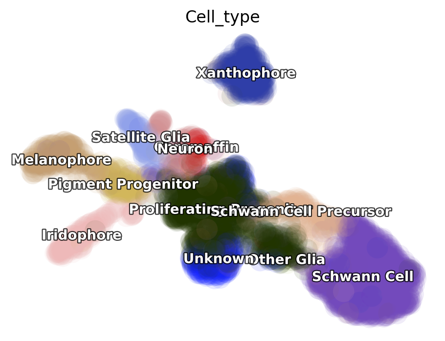
dyn.pl.umap(adata, color='Cell_type')
|-----> retrieve data for non-linear dimension reduction...
|-----> [UMAP] using X_pca with n_pca_components = 30
|-----> <insert> X_umap to obsm in AnnData Object.
|-----> [UMAP] completed [12.7404s]
|-----------> plotting with basis key=X_umap
|-----------> skip filtering Cell_type by stack threshold when stacking color because it is not a numeric type
Kinetic estimation of the conventional scRNA-seq and metabolic labeling based scRNA-seq is often tricky and has a lot pitfalls. Sometimes you may even observed undesired backward vector flow. You can evaluate the confidence of gene-wise velocity via:
adata
AnnData object with n_obs × n_vars = 4181 × 16940
obs: 'split_id', 'sample', 'Size_Factor', 'condition', 'Cluster', 'Cell_type', 'umap_1', 'umap_2', 'batch', 'nGenes', 'nCounts', 'pMito', 'pass_basic_filter', 'initial_cell_size', 'unspliced_Size_Factor', 'initial_unspliced_cell_size', 'spliced_Size_Factor', 'initial_spliced_cell_size', 'ntr', 'cell_cycle_phase'
var: 'nCells', 'nCounts', 'pass_basic_filter', 'log_m', 'score', 'log_cv', 'frac', 'use_for_pca', 'ntr', 'use_for_dynamics'
uns: 'pp', 'velocyto_SVR', 'feature_selection', 'PCs', 'explained_variance_ratio_', 'pca_mean', 'cell_phase_order', 'cell_phase_genes', 'vel_params_names', 'dynamics', 'neighbors', 'umap_fit', 'Cell_type_colors'
obsm: 'X_pca', 'cell_cycle_scores', 'X_umap'
varm: 'vel_params'
layers: 'spliced', 'unspliced', 'X_unspliced', 'X_spliced', 'M_u', 'M_uu', 'M_s', 'M_us', 'M_ss', 'velocity_S'
obsp: 'moments_con'
adata.obs["Cell_type"]
index
TGCCAAATCACCACCT-1-0 Schwann Cell
AAATGCCAGGAGCGTT-1-0 Unknown
CAGCGACAGAGAACAG-1-0 Schwann Cell
GGGACCTGTGACCAAG-1-0 Unknown
TCCCGATAGTGTGGCA-1-0 Schwann Cell
...
TAGACCAAGTCCATAC-1-1 Chromaffin
GGTGTTAAGGAATCGC-1-1 Xanthophore
CTACCCAAGTGACATA-1-1 Proliferating Progenitor
TACTCATGTTACGCGC-1-1 Proliferating Progenitor
TCAACGACACTCTGTC-1-1 Neuron
Name: Cell_type, Length: 4181, dtype: category
Categories (12, object): ['Chromaffin', 'Iridophore', 'Melanophore', 'Neuron', ..., 'Schwann Cell',
'Schwann Cell Precursor', 'Unknown', 'Xanthophore']
dyn.tl.gene_wise_confidence(adata, group='Cell_type', lineage_dict={'Proliferating Progenitor': ['Schwann Cell']})
calculating gene velocity vectors confidence based on phase portrait location with priors of progenitor/mature cell types: 2000it [01:17, 25.93it/s]
Here group is the column for the group informations for cells in the
.obs. lineage_dict is a dictionary indicates broad lineage
information in which key points to the progenitor group while values (a
list) are the possible terminal cell groups, all from the group
column.
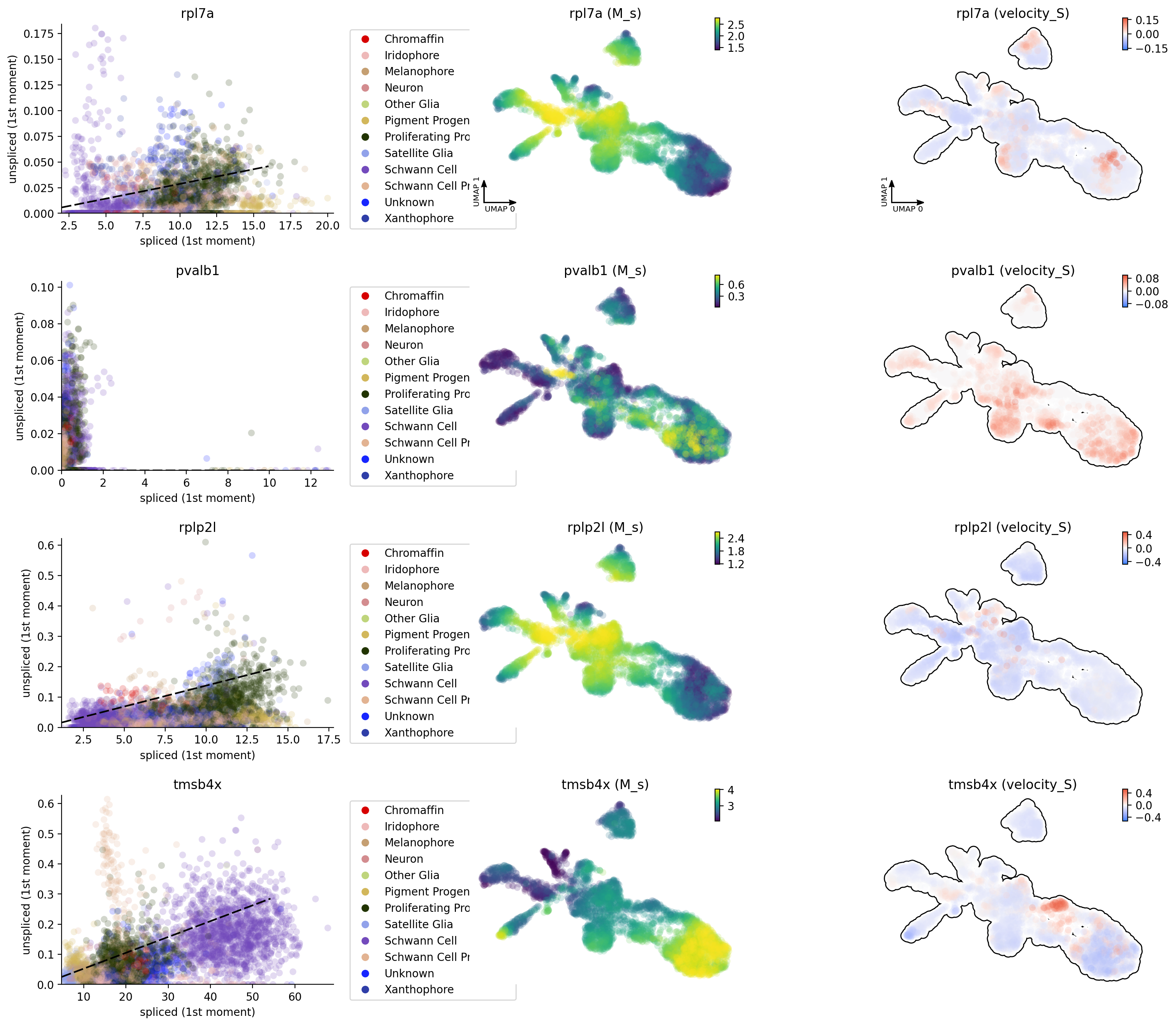
In the following, let us have a look at the phase diagram of some genes
that have velocity calculated. You will see the pvalb1 gene has a
strange phase diagram with a few cells have high spliced expression
values but extremely low unspliced expression values. Those kind of
phase space may points to inproper intron capture of those genes during
the library prepartion or sequencing and they should never be used for
velocity projection and vector field analysis. A tutorial with details
for identifying those genes, evaluating the confidence of velocity
estimation and then correcting (briefly mentioned below) the RNA
velocity results will be released soon.
dyn.pl.phase_portraits(adata, genes=adata.var_names[adata.var.use_for_dynamics][:4], figsize=(6, 4), color='Cell_type')
Velocity projection
In order to visualize the velocity vectors, we need to project the high
dimensional velocity vector of cells to lower dimension (although dynamo
also enables you to visualize raw gene-pair velocity vectors, see
below). The projection involves calculating a transition matrix between
cells for local averaging of velocity vectors in low dimension. There
are three methods to calculate the transition matrix, either kmc,
cosine, pearson. kmc is our new approach to learn the
transition matrix via diffusion approximation or an Itô kernel.
cosine or pearson are the methods used in the original
velocyto or the
scvelo implementation. Kernels that
are based on the reconstructed vector field in high dimension is
also possible and maybe more suitable because of its and robustness and
smoothness. We will show you how to do that in another tutorial soon!
dyn.tl.cell_velocities(adata, method='pearson', other_kernels_dict={'transform': 'sqrt'})
|-----> incomplete neighbor graph info detected: connectivities and distances do not exist in adata.obsp, indices not in adata.uns.neighbors.
|-----> Neighbor graph is broken, recomputing....
|-----> Start computing neighbor graph...
|-----------> X_data is None, fetching or recomputing...
|-----> fetching X data from layer:None, basis:pca
|-----> method arg is None, choosing methods automatically...
|-----------> method ball_tree selected
|-----> [calculating transition matrix via pearson kernel with sqrt transform.] in progress: 100.0000%|-----> [calculating transition matrix via pearson kernel with sqrt transform.] completed [8.9429s]
|-----> [projecting velocity vector to low dimensional embedding] in progress: 100.0000%|-----> [projecting velocity vector to low dimensional embedding] completed [1.9175s]
|-----> method arg is None, choosing methods automatically...
|-----------> method kd_tree selected
AnnData object with n_obs × n_vars = 4181 × 16940
obs: 'split_id', 'sample', 'Size_Factor', 'condition', 'Cluster', 'Cell_type', 'umap_1', 'umap_2', 'batch', 'nGenes', 'nCounts', 'pMito', 'pass_basic_filter', 'initial_cell_size', 'unspliced_Size_Factor', 'initial_unspliced_cell_size', 'spliced_Size_Factor', 'initial_spliced_cell_size', 'ntr', 'cell_cycle_phase'
var: 'nCells', 'nCounts', 'pass_basic_filter', 'log_m', 'score', 'log_cv', 'frac', 'use_for_pca', 'ntr', 'use_for_dynamics', 'avg_prog_confidence', 'avg_mature_confidence', 'use_for_transition'
uns: 'pp', 'velocyto_SVR', 'feature_selection', 'PCs', 'explained_variance_ratio_', 'pca_mean', 'cell_phase_order', 'cell_phase_genes', 'vel_params_names', 'dynamics', 'neighbors', 'umap_fit', 'Cell_type_colors', 'gene_wise_confidence', 'grid_velocity_umap'
obsm: 'X_pca', 'cell_cycle_scores', 'X_umap', 'velocity_umap'
varm: 'vel_params'
layers: 'spliced', 'unspliced', 'X_unspliced', 'X_spliced', 'M_u', 'M_uu', 'M_s', 'M_us', 'M_ss', 'velocity_S'
obsp: 'moments_con', 'distances', 'connectivities', 'pearson_transition_matrix'
You can check the confidence of cell-wise velocity to understand how
reliable the recovered velocity is across cells or even correct
velocty based on some prior:
dyn.tl.cell_wise_confidence(adata)
# dyn.tl.confident_cell_velocities(adata, group='group', lineage_dict={'Progenitor': ['terminal_cell_state']},)
dyn.tl.confident_cell_velocities(adata, group='Cell_type', lineage_dict={'Proliferating Progenitor': ['Schwann Cell']})
calculating gene velocity vectors confidence based on phase portrait location with priors of progenitor/mature cell types: 2000it [01:16, 26.08it/s]
|-----> [calculating transition matrix via pearson kernel with sqrt transform.] in progress: 100.0000%|-----> [calculating transition matrix via pearson kernel with sqrt transform.] completed [14.5190s]
|-----> [projecting velocity vector to low dimensional embedding] in progress: 100.0000%|-----> [projecting velocity vector to low dimensional embedding] completed [1.9353s]
|-----> method arg is None, choosing methods automatically...
|-----------> method kd_tree selected
AnnData object with n_obs × n_vars = 4181 × 16940
obs: 'split_id', 'sample', 'Size_Factor', 'condition', 'Cluster', 'Cell_type', 'umap_1', 'umap_2', 'batch', 'nGenes', 'nCounts', 'pMito', 'pass_basic_filter', 'initial_cell_size', 'unspliced_Size_Factor', 'initial_unspliced_cell_size', 'spliced_Size_Factor', 'initial_spliced_cell_size', 'ntr', 'cell_cycle_phase', 'jaccard_velocity_confidence'
var: 'nCells', 'nCounts', 'pass_basic_filter', 'log_m', 'score', 'log_cv', 'frac', 'use_for_pca', 'ntr', 'use_for_dynamics', 'avg_prog_confidence', 'avg_mature_confidence', 'use_for_transition', 'avg_confidence', 'confident_genes'
uns: 'pp', 'velocyto_SVR', 'feature_selection', 'PCs', 'explained_variance_ratio_', 'pca_mean', 'cell_phase_order', 'cell_phase_genes', 'vel_params_names', 'dynamics', 'neighbors', 'umap_fit', 'Cell_type_colors', 'gene_wise_confidence', 'grid_velocity_umap'
obsm: 'X_pca', 'cell_cycle_scores', 'X_umap', 'velocity_umap'
varm: 'vel_params'
layers: 'spliced', 'unspliced', 'X_unspliced', 'X_spliced', 'M_u', 'M_uu', 'M_s', 'M_us', 'M_ss', 'velocity_S'
obsp: 'moments_con', 'distances', 'connectivities', 'pearson_transition_matrix'
There are three methods implemented for calculating the cell wise
velocity confidence metric. By default it uses jaccard index, which
measures how well each velocity vector meets the geometric constraints
defined by the local neighborhood structure. Jaccard index is calculated
as the fraction of the number of the intersected set of nearest
neighbors from each cell at current expression state (X) and that from
the future expression state (X + V) over the number of the union of
these two sets. The cosine or correlation method is similar to
that used by scVelo.
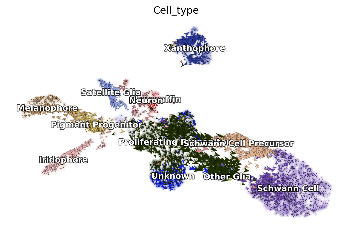
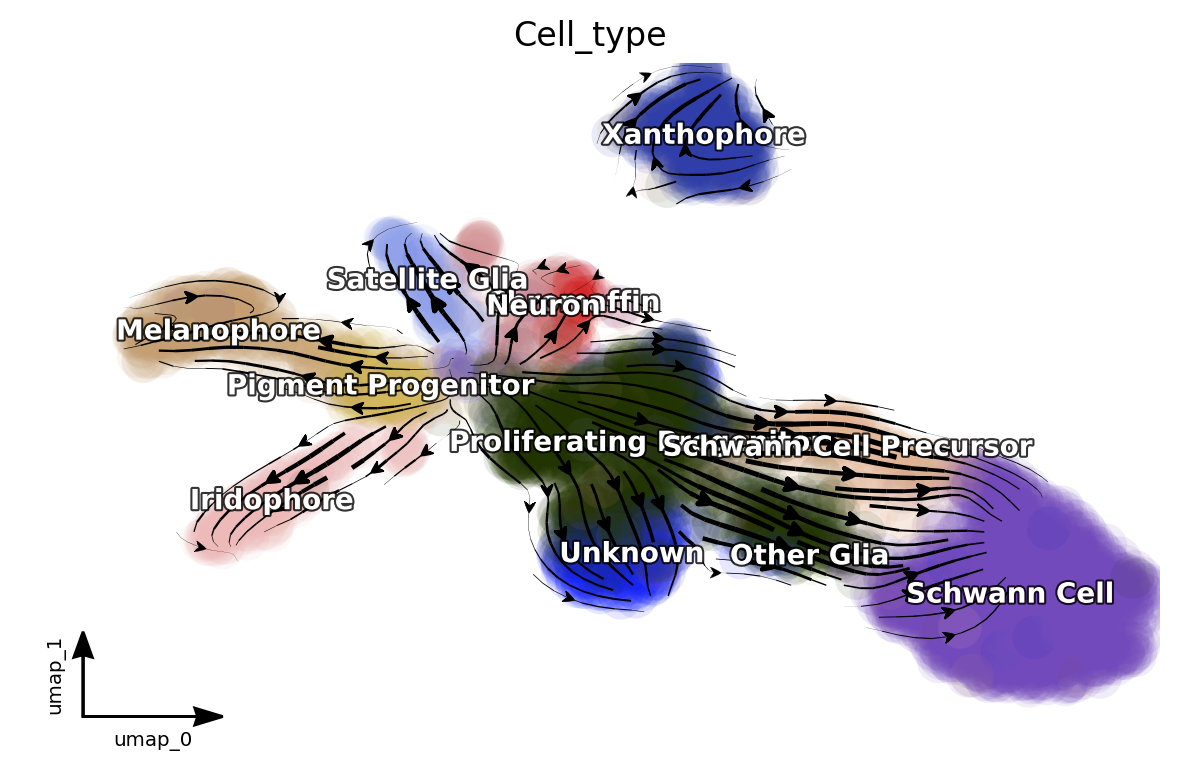
Next let us visualize the projected RNA velocity. We can see that the
recovered RNA velocity flow shows a nice transition from
proliferating progenitors to pigment progenitors which then
bifurcate into either melanophore or iridopore on the left. In
the middle, the proliferating progenitors bifurcate upward into
either chromaffin, neuron or satellite glia cells. On the
right, the proliferation progenitors bifurcate into either
Schwann cell precursor which then become Schwann cells or
other glia. In the bottom, some
proliferating progenitorschoose to become an unkown cell
lineage. In addition, the xanthophore cells are seem to be an
outlier group on the top, indicating it has a different lineage path
comparing to melanophore or iridophore pigment cells. The
transcriptional discontinuity from multipotent progenitors to
xanthophore cells may also imply its lineage trajectory is more
rapid comparing to that of melanophore or iridophore pigment
cells.
dyn.pl.cell_wise_vectors(adata, color=['Cell_type'], basis='umap', show_legend='on data', quiver_length=6, quiver_size=6, pointsize=0.1, show_arrowed_spines=False)
|-----> X shape: (4181, 2) V shape: (4181, 2)
|-----------> plotting with basis key=X_umap
|-----------> skip filtering Cell_type by stack threshold when stacking color because it is not a numeric type
dyn.pl.streamline_plot(adata, color=['Cell_type'], basis='umap', show_legend='on data', show_arrowed_spines=True)
|-----> method arg is None, choosing methods automatically...
|-----------> method kd_tree selected
|-----------> plotting with basis key=X_umap
|-----------> skip filtering Cell_type by stack threshold when stacking color because it is not a numeric type
Note that, if you pass x='gene_a', y='gene_b' to
cell_wise_vectors, grid_vectors or streamline_plot, you can
visualize the raw gene-pair velocity flows. gene_a and gene_b
need to have velocity calculated (or use_for_dynamics in .var
for those genes are True)
Reconstruct vector field
In classical physics, including fluidics and aerodynamics, velocity and acceleration vector fields are used as fundamental tools to describe motion or external force of objects, respectively. In analogy, RNA velocity or protein accelerations estimated from single cells can be regarded as sparse samples in the velocity (La Manno et al. 2018) or acceleration vector field (Gorin, Svensson, and Pachter 2019) that defined on the gene expression space.
In general, a vector field can be defined as a vector-valued function f that maps any points (or cells’ expression state) x in a domain Ω with D dimension (or the gene expression system with D transcripts / proteins) to a vector y (for example, the velocity or acceleration for different genes or proteins), that is f(x) = y.
To formally define the problem of velocity vector field learning, we consider a set of measured cells with pairs of current and estimated future expression states. The difference between the predicted future state and current state for each cell corresponds to the velocity. We suppose that the measured single-cell velocity is sampled from a smooth, differentiable vector field f that maps from xi to yi on the entire domain. Normally, single cell velocity measurements are results of biased, noisy and sparse sampling of the entire state space, thus the goal of velocity vector field reconstruction is to robustly learn a mapping function f that outputs yj given any point xj on the domain based on the observed data with certain smoothness constraints (Jiayi Ma et al. 2013). Under ideal scenario, the mapping function f should recover the true velocity vector field on the entire domain and predict the true dynamics in regions of expression space that are not sampled. To reconstruct vector field function in dynamo, you can simply use the following function to do all the heavy-lifting:
# you can set `verbose = 1/2/3` to obtain different levels of running information of vector field reconstruction
dyn.vf.VectorField(adata, basis='umap', M=1000, pot_curl_div=True)
|-----> VectorField reconstruction begins...
|-----> Retrieve X and V based on basis: UMAP.
Vector field will be learned in the UMAP space.
|-----> Generating high dimensional grids and convert into a row matrix.
|-----> Learning vector field with method: sparsevfc.
|-----> [SparseVFC] begins...
|-----> Sampling control points based on data velocity magnitude...
|-----> method arg is None, choosing methods automatically...
|-----------> method kd_tree selected
|-----> [SparseVFC] completed [19.4236s]
|-----> Running ddhodge to estimate vector field based pseudotime in umap basis...
|-----> graphizing vectorfield...
|-----------? nbrs_idx argument is ignored and recomputed because nbrs_idx is not None and return_nbrs=True
|-----------> calculating neighbor indices...
|-----> method arg is None, choosing methods automatically...
|-----------> method kd_tree selected
|-----> [ddhodge completed] completed [58.0771s]
|-----> Computing curl...
Calculating 2-D curl: 100%|██████████| 4181/4181 [00:00<00:00, 9382.57it/s]
|-----> Computing divergence...
Calculating divergence: 100%|██████████| 5/5 [00:00<00:00, 13.52it/s]
|-----> [VectorField] completed [78.6580s]
Vector field recunstruction is blazingly efficient and scale linearly with the cell number and dimensions. So you can do vector field reconstruction for hundred thousands of cells in PCA space on a matter of minutes. How good your vector field reconstruction is? We have several metrics to quantify that and we will provide a detailed tutorial on that in a couple of days. The easiest way, though, is to check the energy / energy change rate to see whether they are decreasing and gradually stabiling during the vector field learning process:
dyn.pl.plot_energy(adata, basis='umap')
Characterize vector field topology
Since we learn the vector field function of the data, we can then characterize the topology of the full vector field space. For example, we are able to identify
the fixed points (attractor/saddles, etc.) which may corresponds to terminal cell types or progenitors;
nullcline, separatrices of a recovered dynamic system, which may formally define the dynamical behaviour or the boundary of cell types in gene expression space.
Note that we use the name of topography instead of topology in
tools or plot modules because we figured out the 2D full vector
field plot (instead of just domains with cells as those visualized by
streamline_plot function) with those fixed points, nullclines, etc.
looks like a topography plot. Enlighten us if you have a better idea.
And see also more discussion
here.
When we recostruct a 2 D vector field (which is the case above), we automatically characterize the vector field topology. Let us take a look a the fixed points identified by dynamo for this system.
dyn.pl.topography(adata, basis='umap', n=200, background='white', color=['ntr', 'Cell_type'], streamline_color='black', show_legend='on data', frontier=True)
|-----> Vector field for umap is but its topography is not mapped. Mapping topography now ...
|-----> method arg is None, choosing methods automatically...
|-----------> method kd_tree selected
|-----------> plotting with basis key=X_umap
|-----------> skip filtering Cell_type by stack threshold when stacking color because it is not a numeric type
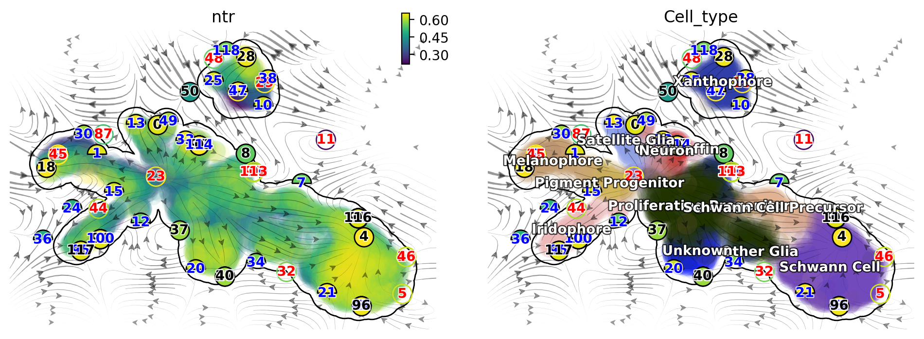
There are a lot of fixed points identified by dynamo. Some of them are less confident than others and we use the filled color of each node to represent the confidence. The shape of node also has some meaning. Half circles are saddle points while full circle are stable fixed points (the eigenvalue of the jacobian matrix at those places are all negative based on the reconstructed vector field). The color of digits in each node is related to the type of fixed points:
\(\color{black}{\text{black}}\): absorbing fixed points;
\(\color{red}{\text{red}}\): emitting fixed points;
\(\color{blue}{\text{blue}}\): unstable fixed points.
We notice that, interesting, node 23 corresponds an emitting fixed
point which makes sense as it is located in the domain of progenitor
cell state; on the other hand, nodes 18, 117, 40 and 28 are
absorbing fixed points, and each corresponds to the melanophore,
iridophore, unknown or the xanthophore terminal cell type
state. Lastly, nodes 15 and 32 are unstable fixed points (saddle
points), each corresponds to the bifurcation point of the iridophore and
melanophore lineages or that of the neuron and satellite glia lineages.
So overall this topology analysis did a pretty good job!
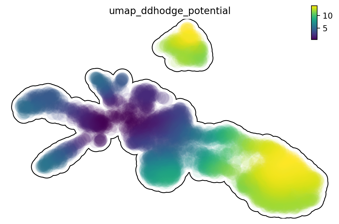
The concept of potential landscape is widely appreciated across various biological disciplines, for example the adaptive landscape in population genetics, protein-folding funnel landscape in biochemistry, epigenetic landscape in developmental biology. In the context of cell fate transition, for example, differentiation, carcinogenesis, etc, a potential landscape not only offers an intuitive description of the global dynamics of the biological process but also provides key insights to understand the multi-stability and transition rate between different cell types as well as to quantify the optimal path of cell fate transition.
The classical definition of potential function in physics requires gradient systems (no curl/cycling part), it thus is often not applicable to open biological system. In dynamo we provided several ways to quantify the potential of single cells by decomposing the vector field into gradient, curl parts, etc and use the gradient part to define potential. The recommended method is built on the Hodge decomposition on simplicial complexes (a sparse directional graph) constructed based on the learned vector field function that provides fruitful analogy of gradient, curl and harmonic (cyclic) flows on manifold.
Single cell potential (In fact, it is the negative of potential here for
the purpose to match up with the common usuage of pseudotime so that
small values correspond to the progenitor state while large values
terminal cell states.) estimated by dynamo can be regarded as a
replacement of pseudotime. Since dynamo utilizes velocity which consists
of direction and magnitude of cell dynamics, potential should be more
relevant to real time and intrinsically directional (so you don’t need
to orient the trajectory).
dyn.pl.umap(adata, color='umap_ddhodge_potential', frontier=True)
|-----------> plotting with basis key=X_umap
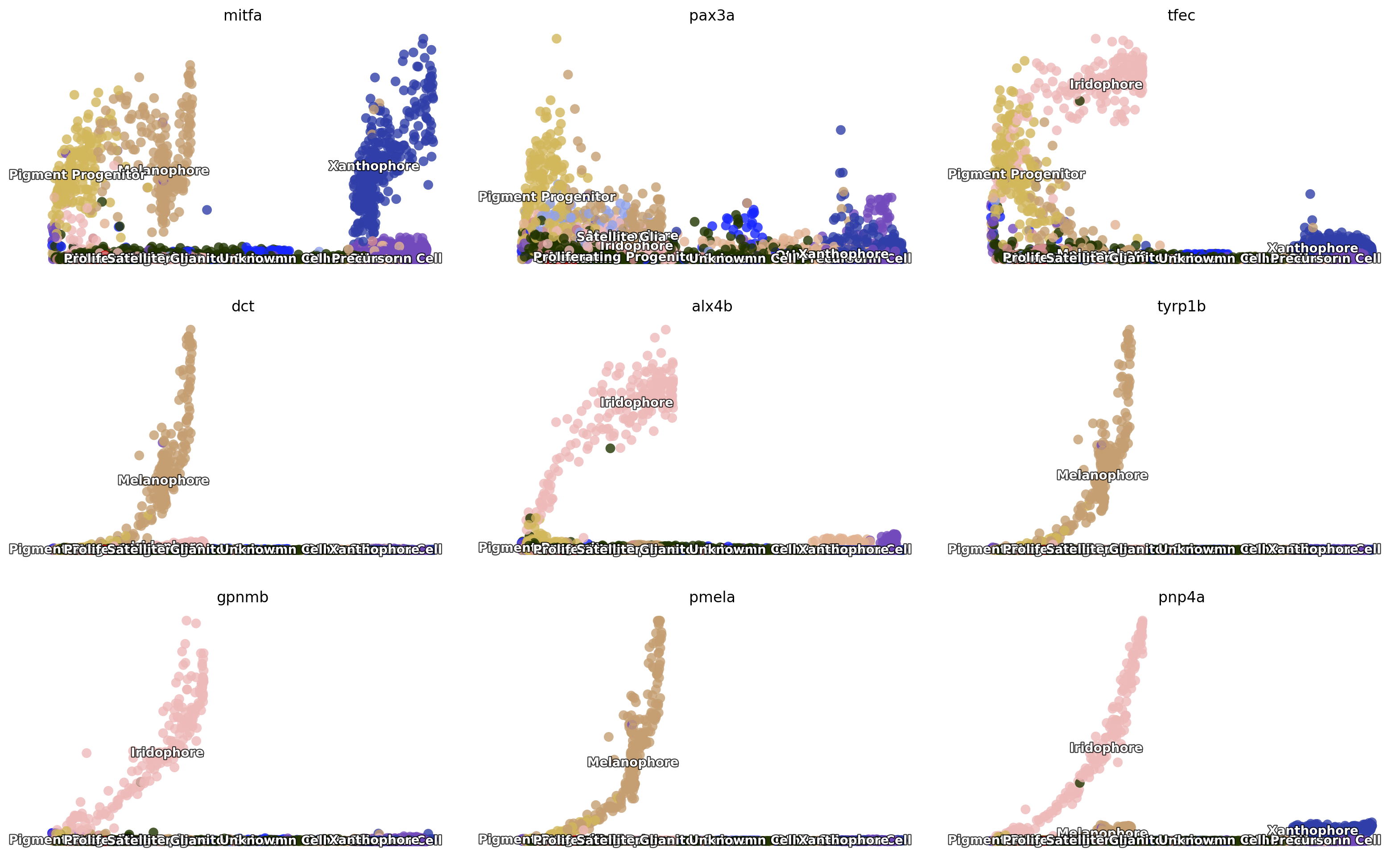
Here we can check a few genes from figure 3 (si 5) of Saunders, et
al (2019) to see their expression dynamics over time. As expected, we
can see that mitfa expression declined only marginally with
melanophore differentiation yet decreased markedly with a transition
from progenitor to iridophore as expected (Curran et al., 2010).
pax3a was expressed in pigment progenitors and decreased across
pseudotime in melanophores, whereas expression of tfec, a
transcription factor expressed in iridophores (Lister et al., 2011),
increased over pseudotime. Melanin synthesis enzyme genes, dct and
tyrp1b, as well as pmel, encoding a melanosome-associated
transmembrane protein, all increased over pseudotime in melanophores. In
iridophores, gpnmb and pnp4a showed elevated expression late in
pseudotime, as expected (Curran et al., 2010; Higdon et al., 2013).
import numpy as np
fig3_si5 = ['mitfa', 'pax3a', 'tfec', 'dct', 'alx4b', 'tyrp1b', 'gpnmb', 'pmela', 'pnp4a']
dyn.pl.scatters(adata, x=np.repeat('umap_ddhodge_potential', 9), pointsize=0.25, alpha=0.8, y=fig3_si5, layer='X_spliced', color='Cell_type',
ncols=3, background='white', figsize=(7, 4))
|-----------> plotting with basis key=X_umap
|-----------> skip filtering Cell_type by stack threshold when stacking color because it is not a numeric type
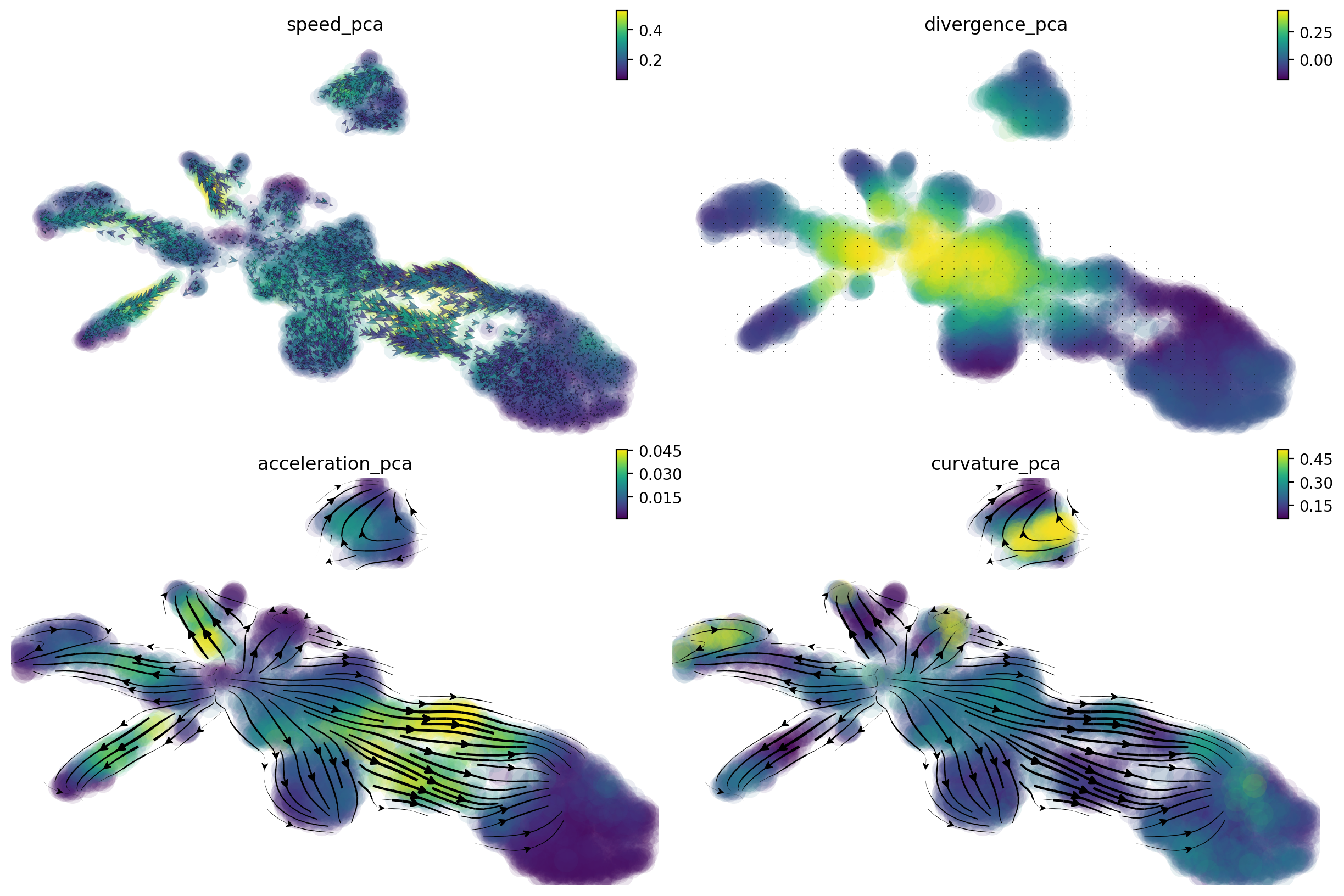
Beyond RNA velocity
Here let us take a glimpse on how dynamo can go beyond RNA velocity
analysis by taking advantage of the analytical vector field function it
learns. Here we will first project the RNA velocity to pca space and
then reconstruct the vector field function in the PCA space. We then
followed by calculating curl (curl is calculated in 2
dimensional UMAP space by default as it is only defined in 2/3
dimension), divergence, acceleration and curvature. Those
calculations are incredibly efficient (on the order of seconds for ten
thousands of cells in 30 PCs) as they are calculated analytically based
on the reconstructed vector field function.
curl: a quantity to characterize the infinitesimal rotation of a cell state based on the reconstructed vector field.
in 2D, curl is a value; in 3D curl, is a matrix.
if rotation is clockwise, 2D curl has negative value and vice versa
combinbing with expression of cell cycle markers, curl analysis can help us to reveal whether a cell is going through a strong cell cycle process.
divergence: a quantity to characterize local “outgoingness” of a cell – the extent to which there is more of the field vectors exiting an infinitesimal region of space than entering it.
positive values means cells is going out to become other cells or cell’s movement to other cell is speeded up and vice versa.
divergence analysis can be used to reveal progenitor (source) or a terminal cell state (sink).
acceleration: the derivative of velocity vector.
if cell speeds up (normally happen when cells exit cell cycle and start to commit), the acceleration will be positive and vice versa.
RNA acceleration is a vector like RNA velocity vector so you can actually plot acceleration field like velocity field (that is why we name our vector flow related plotting functions
cell_wise_vectors,grid_vectorsto support plotting bothvelocityandacceleration field(see below)).Here the norm of the acceleration for all PC components in each cells will be calculated and visualized (like the speed/magnitude of the velocity vector).
curvature: a quantity to characterize the curviness a cell’s vector field trajectory.
if a progenitor develops into multiple lineages, some of those paths will have curvature (it is like making a turn on a crossroad while driving a car).
genes strongly contribute to the curvature correspond to regulatory genes steering the cell fate
dyn.tl.cell_velocities(adata, basis='pca')
dyn.vf.VectorField(adata, basis='pca')
dyn.vf.speed(adata, basis='pca')
dyn.vf.curl(adata, basis='umap')
dyn.vf.divergence(adata, basis='pca')
dyn.vf.acceleration(adata, basis='pca')
dyn.vf.curvature(adata, basis='pca')
Using existing pearson_transition_matrix found in .obsp.
|-----> [projecting velocity vector to low dimensional embedding] in progress: 100.0000%|-----> [projecting velocity vector to low dimensional embedding] completed [3.2535s]
|-----> method arg is None, choosing methods automatically...
|-----------> method kd_tree selected
|-----> VectorField reconstruction begins...
|-----> Retrieve X and V based on basis: PCA.
Vector field will be learned in the PCA space.
|-----> Learning vector field with method: sparsevfc.
|-----> [SparseVFC] begins...
|-----> Sampling control points based on data velocity magnitude...
|-----> method arg is None, choosing methods automatically...
|-----------> method ball_tree selected
|-----> [SparseVFC] completed [0.7945s]
|-----> [VectorField] completed [1.1797s]
Calculating 2-D curl: 100%|██████████| 4181/4181 [00:00<00:00, 6207.79it/s]
Calculating divergence: 100%|██████████| 5/5 [00:01<00:00, 4.93it/s]
|-----> [Calculating acceleration] in progress: 100.0000%|-----> [Calculating acceleration] completed [0.4161s]
|-----> [Calculating acceleration] in progress: 100.0000%|-----> [Calculating acceleration] completed [0.4666s]
|-----> [Calculating curvature] in progress: 100.0000%|-----> [Calculating curvature] completed [0.3418s]
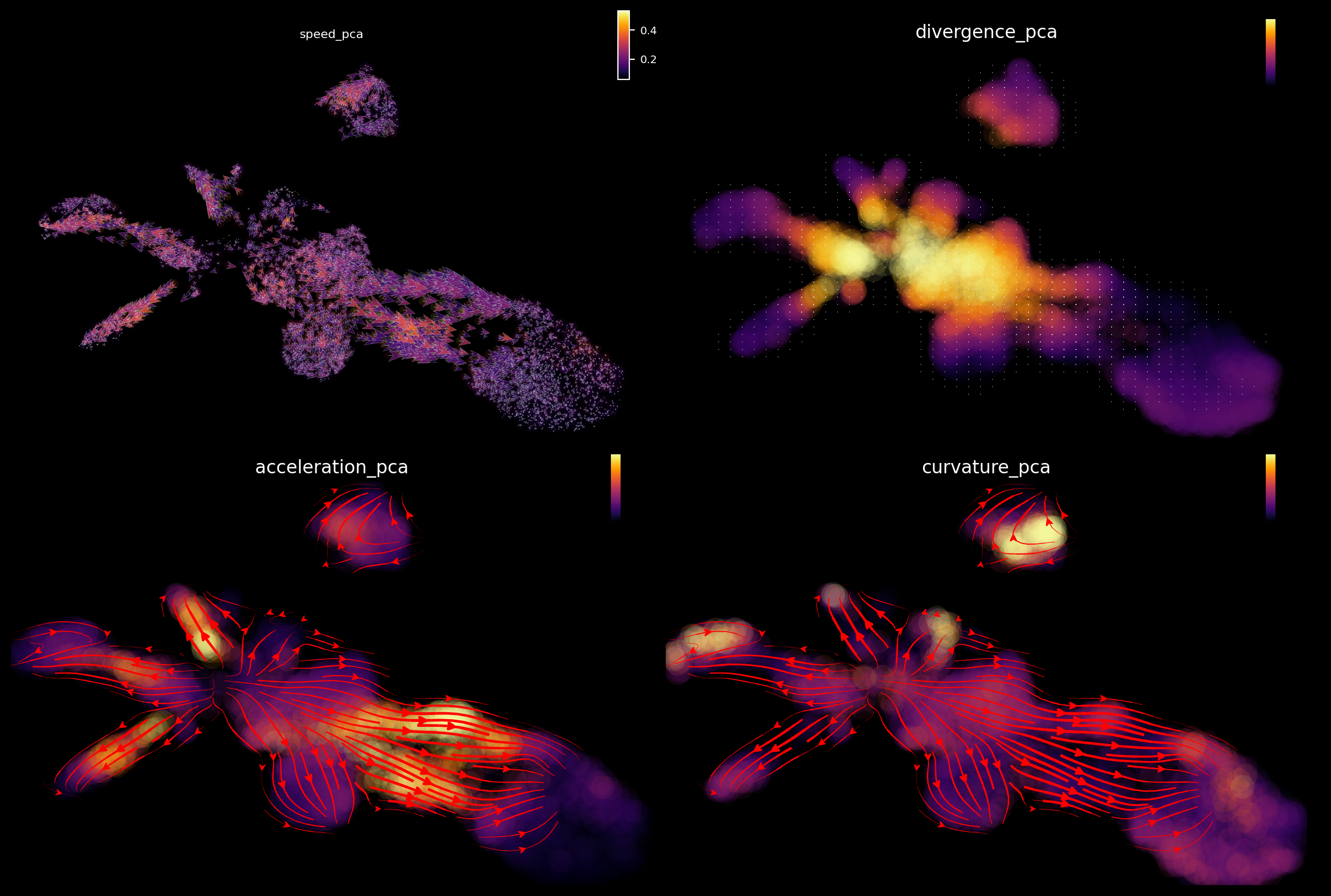
Integrative analysis
We can integrate those above quantities to fully characterize the regulatory mechanism during zebrafish pigmentation.
A separate tutorial is needed to fully explore these analyses, but let’s take a quick look at the results. We can see that:
from cell speed and acceleration, progenitors generally have low speed as it is like a metastable cell state. However transition of pigment progenitors and proliferating progenitors speeds up after committing to a particular lineage, for example, iridophore/melanophore/shawnn cell lineage, etc.
from cell divergence, those progenitors (pigment progenitors and proliferating progenitors) functions like a source with high divergence while melanophore/iridophores/chromaffin/schawn cells as well as other cell types functions like a sink with significantly lower divergence.
from cell curvature, when cell makes cell fate decisions (at the bifurcation point of iridophore and melanophore lineages or that of the neuron and satellite glia lineages), strong curvature is apparent. Curvature is also artificially strong when velocity is noisy.
import matplotlib.pyplot as plt
fig1, f1_axes = plt.subplots(ncols=2, nrows=2, constrained_layout=True, figsize=(12, 8))
f1_axes
f1_axes[0, 0] = dyn.pl.cell_wise_vectors(adata, color='speed_pca', pointsize=0.5, alpha = 0.7, ax=f1_axes[0, 0], quiver_length=6, quiver_size=6, save_show_or_return='return')
f1_axes[0, 1] = dyn.pl.grid_vectors(adata, color='divergence_pca', ax=f1_axes[0, 1], quiver_length=12, quiver_size=12, save_show_or_return='return')
f1_axes[1, 0] = dyn.pl.streamline_plot(adata, color='acceleration_pca', ax=f1_axes[1, 0], save_show_or_return='return')
f1_axes[1, 1] = dyn.pl.streamline_plot(adata, color='curvature_pca', ax=f1_axes[1, 1], save_show_or_return='return')
plt.show()
|-----> X shape: (4181, 2) V shape: (4181, 2)
|-----------> plotting with basis key=X_umap
|-----> method arg is None, choosing methods automatically...
|-----------> method kd_tree selected
|-----------> plotting with basis key=X_umap
|-----> method arg is None, choosing methods automatically...
|-----------> method kd_tree selected
|-----------> plotting with basis key=X_umap
|-----> method arg is None, choosing methods automatically...
|-----------> method kd_tree selected
|-----------> plotting with basis key=X_umap
Emulate ggplot2 plotting styple with black background, get ready for a cool presentation!!!
dyn.configuration.set_figure_params('dynamo', background='black')
fig1, f1_axes = plt.subplots(ncols=2, nrows=2, constrained_layout=True, figsize=(12, 8))
f1_axes
f1_axes[0, 0] = dyn.pl.cell_wise_vectors(adata, color='speed_pca', pointsize=0.1, alpha = 0.7, ax=f1_axes[0, 0], quiver_length=6, quiver_size=6, save_show_or_return='return', background='black')
f1_axes[0, 1] = dyn.pl.grid_vectors(adata, color='divergence_pca', ax=f1_axes[0, 1], quiver_length=12, quiver_size=12, save_show_or_return='return', background='black')
f1_axes[1, 0] = dyn.pl.streamline_plot(adata, color='acceleration_pca', ax=f1_axes[1, 0], save_show_or_return='return', background='black')
f1_axes[1, 1] = dyn.pl.streamline_plot(adata, color='curvature_pca', ax=f1_axes[1, 1], save_show_or_return='return', background='black')
plt.show()
|-----> X shape: (4181, 2) V shape: (4181, 2)
|-----------> plotting with basis key=X_umap
|-----> method arg is None, choosing methods automatically...
|-----------> method kd_tree selected
|-----------> plotting with basis key=X_umap
|-----> method arg is None, choosing methods automatically...
|-----------> method kd_tree selected
|-----------> plotting with basis key=X_umap
|-----> method arg is None, choosing methods automatically...
|-----------> method kd_tree selected
|-----------> plotting with basis key=X_umap
Animate fate transition
Before we go, let us have some fun with animating cell fate commitment predictions via reconstructed vector field function. This cool application hopefully will also convince you that vector field reconstruction can enable some amazing analysis that is hardly imaginable before. With those and many other possibilities in single cell genomics, the prospect of biology to finally become a discipline as qualitative as physics and mathematics has never been so promising!
To animate cell fate prediction, we need to first select some progenitor cells as initial cell states.
progenitor = adata.obs_names[adata.obs.Cell_type.isin(['Proliferating Progenitor', 'Pigment Progenitor'])]
len(progenitor)
1194
Then, we need to predict the cell fate trajectory via integrating with the vector field function, starting from those initial cell states.
dyn.pd.fate(adata, basis='umap', init_cells=progenitor, interpolation_num=100, direction='forward',
inverse_transform=False, average=False, cores=3)
AnnData object with n_obs × n_vars = 4181 × 16940
obs: 'split_id', 'sample', 'Size_Factor', 'condition', 'Cluster', 'Cell_type', 'umap_1', 'umap_2', 'batch', 'nGenes', 'nCounts', 'pMito', 'pass_basic_filter', 'initial_cell_size', 'unspliced_Size_Factor', 'initial_unspliced_cell_size', 'spliced_Size_Factor', 'initial_spliced_cell_size', 'ntr', 'cell_cycle_phase', 'jaccard_velocity_confidence', 'umap_ddhodge_div', 'umap_ddhodge_potential', 'curl_umap', 'divergence_umap', 'control_point_umap', 'inlier_prob_umap', 'obs_vf_angle_umap', 'control_point_pca', 'inlier_prob_pca', 'obs_vf_angle_pca', 'speed_pca', 'divergence_pca', 'acceleration_pca', 'curvature_pca'
var: 'nCells', 'nCounts', 'pass_basic_filter', 'log_m', 'score', 'log_cv', 'frac', 'use_for_pca', 'ntr', 'use_for_dynamics', 'avg_prog_confidence', 'avg_mature_confidence', 'use_for_transition', 'avg_confidence', 'confident_genes'
uns: 'pp', 'velocyto_SVR', 'feature_selection', 'PCs', 'explained_variance_ratio_', 'pca_mean', 'cell_phase_order', 'cell_phase_genes', 'vel_params_names', 'dynamics', 'neighbors', 'umap_fit', 'Cell_type_colors', 'gene_wise_confidence', 'grid_velocity_umap', 'VecFld_umap', 'mitfa_colors', 'pax3a_colors', 'tfec_colors', 'dct_colors', 'alx4b_colors', 'tyrp1b_colors', 'gpnmb_colors', 'pmela_colors', 'pnp4a_colors', 'grid_velocity_pca', 'VecFld_pca', 'fate_umap'
obsm: 'X_pca', 'cell_cycle_scores', 'X_umap', 'velocity_umap', 'velocity_umap_SparseVFC', 'X_umap_SparseVFC', 'velocity_pca', 'velocity_pca_SparseVFC', 'X_pca_SparseVFC', 'acceleration_pca', 'curvature_pca'
varm: 'vel_params'
layers: 'spliced', 'unspliced', 'X_unspliced', 'X_spliced', 'M_u', 'M_uu', 'M_s', 'M_us', 'M_ss', 'velocity_S', 'acceleration', 'curvature'
obsp: 'moments_con', 'distances', 'connectivities', 'pearson_transition_matrix', 'umap_ddhodge'
Furthermore, we need to prepare a matplotlib axes as the background
of the animation and then the animated components from each frame will
be plotted on its top. Here I use the topography plot as the
background but you can use other plots if you like.
%%capture
fig, ax = plt.subplots()
ax = dyn.pl.topography(adata, color='Cell_type', ax=ax, save_show_or_return='return')
|-----------> plotting with basis key=X_umap
|-----------> skip filtering Cell_type by stack threshold when stacking color because it is not a numeric type
The dyn.mv.* module provides functionalities to create necessary
components to produce an animation that describes the estimated speed of
a set of cells at each time point, its movement in gene expression space
and the long range trajectory predicted by the reconstructed vector
field functions. Thus it provides intuitive visual understanding of the
RNA velocity, speed, acceleration, and cell fate commitment in action!!
%%capture
instance = dyn.mv.StreamFuncAnim(adata=adata, color='Cell_type', ax=ax)
|-----? the number of cell states with fate prediction is more than 50. You may want to lower the max number of cell states to draw via cell_states argument.
|-----------> plotting with basis key=X_umap
|-----------> skip filtering Cell_type by stack threshold when stacking color because it is not a numeric type
Lastly, let us embed the animation into our notebook.
Note that here I have to set animation.embed_limit rc parameter to a
big value (in MB) to ensure all frames of the animation will be embedded
in this notebook.
import matplotlib
matplotlib.rcParams['animation.embed_limit'] = 2**128 # Ensure all frames will be embedded.
from matplotlib import animation
import numpy as np
anim = animation.FuncAnimation(instance.fig, instance.update, init_func=instance.init_background,
frames=np.arange(100), interval=100, blit=True)
from IPython.core.display import display, HTML
HTML(anim.to_jshtml()) # embedding to jupyter notebook.