Molecular mechanism of megakaryocytes
One intriguing phenomenon observed in hematopoiesis is that commitment to and appearance of the Meg lineage occurs more rapidly than other lineages (Sanjuan-Pla et al., 2013; Yamamoto et al., 2013). However, the mechanisms underlying this process remain elusive. To mechanistically investigate these findings, we try to first reveal the timing of the maturation of megakaryocytes and then the underlying regulatory networks.
Specifically, in this tutorial, we will guide you through the following three major analyses:
learn vector field of human hematopoiesis and identify fixed points of cell type
compute and visualize vector field based pseudotime (based on ddhodge algorithm)
perform differential geometry analyses to reveal a minimal network of Meg’s early appearance
To begin with, let us first import relevant packages
%%capture

import numpy as np
import pandas as pd
import matplotlib.pyplot as plt

import sys
import os

import dynamo as dyn
import seaborn as sns

dyn.dynamo_logger.main_silence()

# filter warnings for cleaner tutorials
import warnings
warnings.filterwarnings('ignore')
Next, let us download the processed hematopoiesis adata object (see this notebook to find out how to estimate the labeling RNA velocity for this dataset) that comes with the dynamo package.
adata_labeling = dyn.sample_data.hematopoiesis()
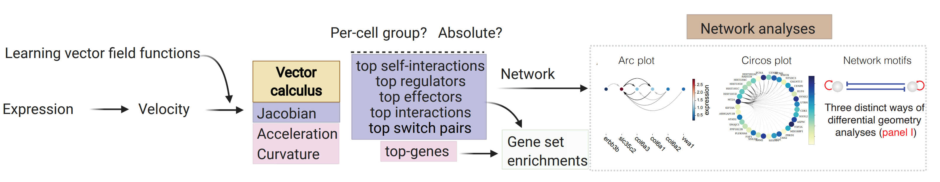
Before we perform the actual analyses, we will first introduce a cartoon that can be used to help understanding how dynamo can be used to perform many novel analyses that are not available with any other tools to gain mechanistic insights.
How to use dynamo to gain mechanistic insights with its unique differential geometry analyses
In general, from the RNA velocity data, we can learn the vector field function in high dimensional space and then we can use it to perform differential analyses and gene-set enrichment analyses based on top-ranked acceleration or curvature genes, as well as the top-ranked genes with the strongest self-interactions, top-ranked regulators/targets, or top-ranked interactions for each gene in individual cell types or across all cell types, with either raw or absolute values. Integrating that ranking information, we can build regulatory networks across different cell types, which can then be visualized with ArcPlot, CircosPlot, or other visualizations. Lastly, dynamo can be also used to identify top toggle-switch pairs driving cell-fate bifurcations. We will discuss parts of these analyses in this notebook but you should also check the extensive analyses demonstrated in the zebrafish differential geometry analyses notebook from here: Zebrafish
Map the topography of human hematopoiesis and associative fixed points
To map the topography of a vector field space, we will need to first learn the vector field function in that space which can be done with the following code. Since the data we preprocessed in dynamo already include the vector field in the umap space. The following step can be skipped.
Associate fixed points to cell types
We next run the vf.topography function to retrieve fixed points. Because of the numerical instability of the learned vector field resulted from the noisy data, dynamo tends to identify many fixed points. Manually post-processing will be needed to associate each fix point to a particular cell state.
dict_keys(['C', 'E_traj', 'P', 'V', 'VFCIndex', 'X', 'X_ctrl', 'X_data', 'Xss', 'Y', 'beta', 'confidence', 'ctrl_idx', 'ftype', 'grid', 'grid_V', 'iteration', 'method', 'nullcline', 'sigma2', 'tecr_traj', 'valid_ind', 'xlim', 'ylim'])
dyn.vf.topography(adata_labeling, n=750, basis='umap');
dyn.pl.topography(
    adata_labeling,
    markersize=500,
    basis="umap",
    fps_basis="umap",
    streamline_alpha=0.9,
)
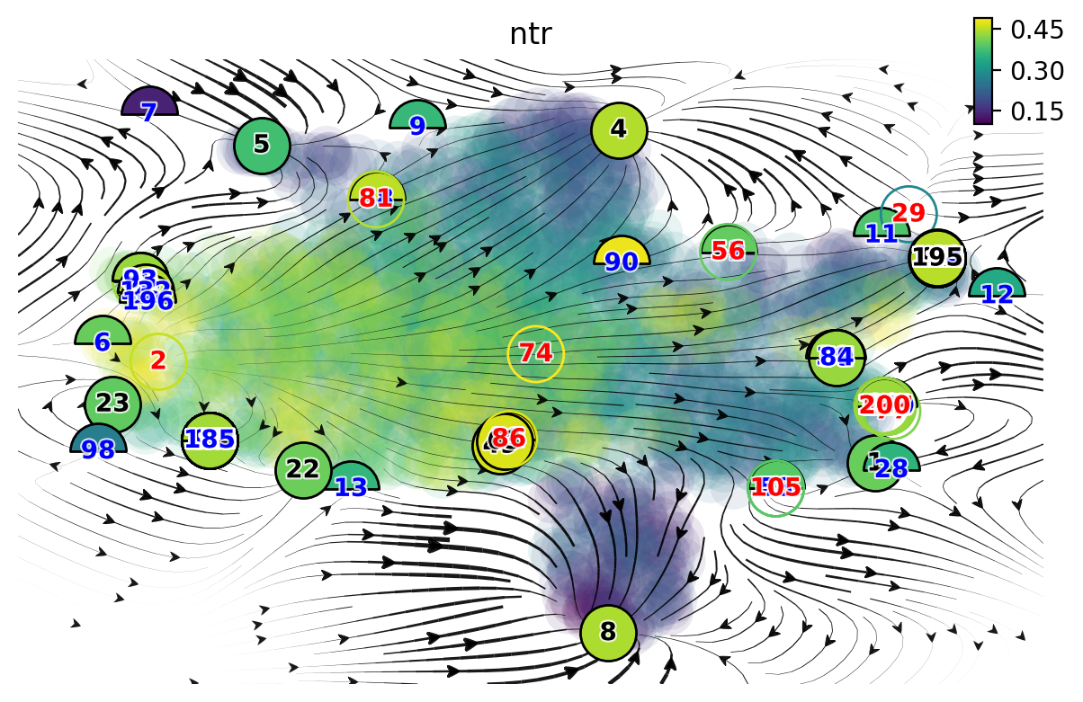
As you can see, we have way more fixed points than we want. Therefore we manually select fixed points, simply by
identifying points that are associated with a particular cell fate. Specifically, we will also leverage the
Xss, ftype keys that are associated with all those identified fixed points.
Xss is for the fixed points
coordinates while ftype is for the specific fixed point type, denoted by
integers.-1: stable
0: saddle
1: unstable
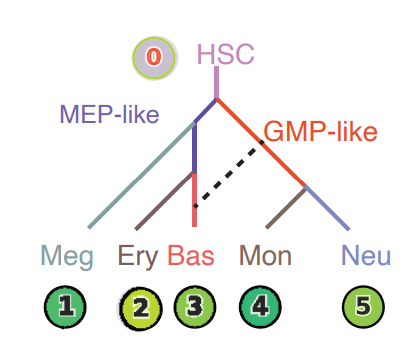
In the following figure, the color of digits in each node reflects the type of fixed point: red, emitting fixed point; black, absorbing fixed point. The color of the numbered nodes corresponds to the confidence of the fixed points with lighter (yellowish color) higher confidence and vice versa.
Xss, ftype = adata_labeling.uns['VecFld_umap']['Xss'], adata_labeling.uns['VecFld_umap']['ftype']
# good_fixed_points = [0, 2, 5, 29, 11, 28] # n=250
good_fixed_points = [2, 8, 1, 195, 4, 5] # n=750

adata_labeling.uns['VecFld_umap']['Xss'] = Xss[good_fixed_points]
adata_labeling.uns['VecFld_umap']['ftype'] = ftype[good_fixed_points]
dyn.pl.topography(
    adata_labeling,
    markersize=500,
    basis="umap",
    fps_basis="umap",
    #   color=['pca_ddhodge_potential'],
    color=["cell_type"],
    streamline_alpha=0.9,
)
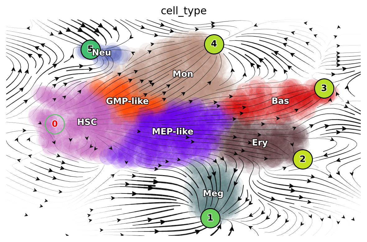
It is worth noting that those fixed points are later used in the optimal path predictions as shown here: LAP
Lineage tree of hematopoiesis
We can then run the dyn.pd.tree_model(adata_labeling) function to lumped cells from each population from the vector
field built in the UMAP space to create a lineage tree that nicely recapitulate the known hierarchy of each cell lineage.
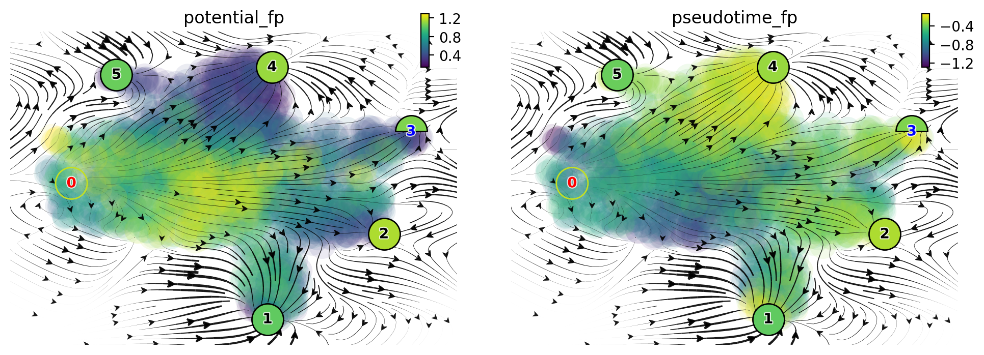
Vector field pseudotime
We now move to demonstrate how we can use dynamo to reveal the early appearance of Meg lineage. Specifically we use ddhodge to calculate the vector field based pseudotime with the velocity transition matrix. More details can be found in the following:
Define a colormap we will use later
dynamo_color_dict = {
    "Mon": "#b88c7a",
    "Meg": "#5b7d80",
    "MEP-like": "#6c05e8",
    "Ery": "#5d373b",
    "Bas": "#d70000",
    "GMP-like": "#ff4600",
    "HSC": "#c35dbb",
    "Neu": "#2f3ea8",
}
**Initialize a Dataframe object that we will use for plotting with sns or matplotlib **
valid_cell_type = ["HSC", "MEP-like", "Meg", "Ery", "Bas"]
valid_indices = adata_labeling.obs["cell_type"].isin(valid_cell_type)
df = adata_labeling[valid_indices].obs[["pca_ddhodge_potential", "umap_ddhodge_potential", "cell_type"]]
df["cell_type"] = list(df["cell_type"])
from dynamo.tools.graph_operators import build_graph, div, potential
g = build_graph(adata_labeling.obsp["cosine_transition_matrix"])
ddhodge_div = div(g)
potential_cosine = potential(g, -ddhodge_div)
adata_labeling.obs["cosine_potential"] = potential_cosine
The above uses the cosine_transition_matrix to compute the vector field based pseudotiem but you can also
compute it with other kernels, such as the fp_transition_rate and store the results in the dataframe object df
we created above. Note that fp stands for fokker planck method.
Please refer to the dynamo documentation for more details on the
related methods.
g = build_graph(adata_labeling.obsp["fp_transition_rate"])
ddhodge_div = div(g)
potential_fp = potential(g, ddhodge_div)
set potential_fp and pseudotime_fp in adata.obs to facilitate visualizing the
potential and pseudotime across cells.
adata_labeling.obs["potential_fp"] = potential_fp
adata_labeling.obs["pseudotime_fp"] = -potential_fp
dyn.pl.topography(
    adata_labeling,
    markersize=500,
    basis="umap",
    fps_basis="umap",
    color=["potential_fp", "pseudotime_fp"],
    streamline_alpha=0.9,
)
df["cosine"] = potential_cosine[valid_indices]
df["fp"] = potential_fp[valid_indices]
sns.displot(
    data=df,
    x="cosine",
    hue="cell_type",
    kind="ecdf",
    stat="count",
    palette=dynamo_color_dict,
    height=2.5,
    aspect=95.5 / 88.8,
)
plt.xlim(0.0, 0.008)
plt.ylim(0, 12)
plt.xlabel("vector field pseudotime")
Text(0.5, 9.444444444444438, 'vector field pseudotime')
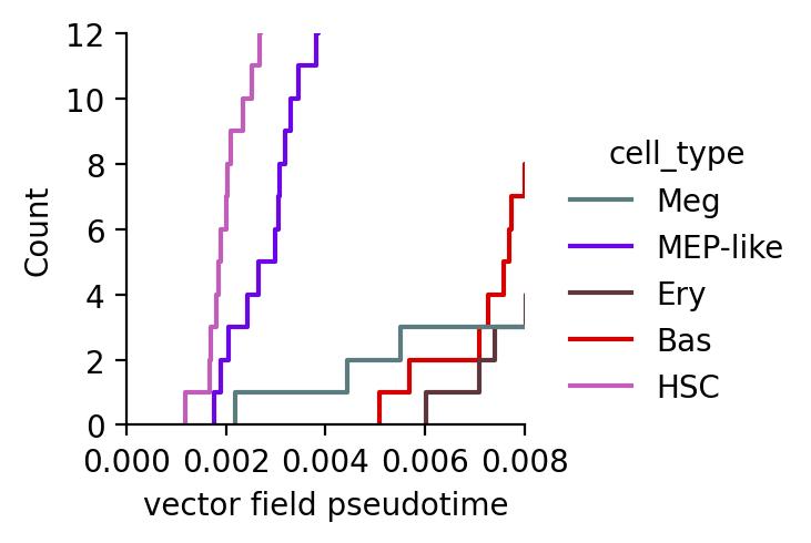
From the above analysis, we can clearly see that megakaryocytes appear earliest among the Meg, Ery, and Bas lineages, in line with what has been reported previously.
Molecular mechanisms underlying the early appearance of the Meg lineage
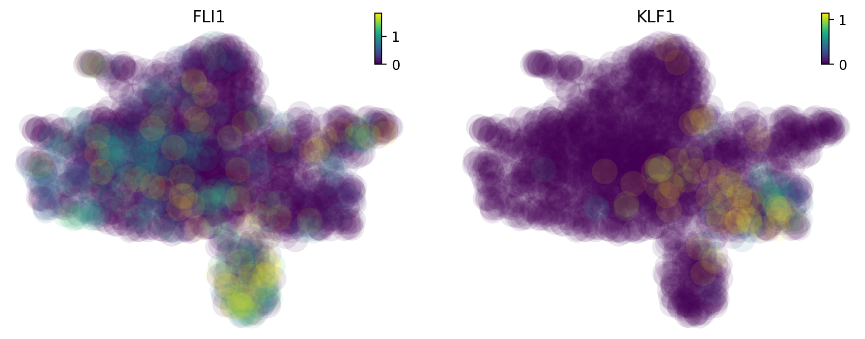
Interestingly, this early appearance of Meg lineage is further reinforced by its considerably higher RNA speed (Figure S6B) and acceleration (Figure 5E) relative to all other lineages. When inspecting the expression of FLI1 and KLF1 (Siatecka and Bieker, 2011), known master regulators of Meg and Ery lineages, respectively, we observed high expression of FLI1, rather than KLF1, beginning at the HSPC state (Figure S6C), as shown below:
High expression of FLI1, instead of KLF1, beginning at the progenitor state
dyn.pl.umap(adata_labeling, color=["FLI1", "KLF1"], layer="X_total")
High speed, acceleration and low divergence and curvature of the Meg lineage
Here we will use dynamo to speed, divergence, acceleration and curvature on the pca space. Note that dynamo calculate acceleration and curvature as a cell by gene matrix, just like the gene expression matrix. Here we will plot the magnitude of the acceleration and curvature vectors, similar to caculating the speed of RNA velocity vectors. RNA divergence is a scalar for each cell.
basis = "pca"
dyn.vf.speed(adata_labeling, basis=basis)
dyn.vf.divergence(adata_labeling, basis=basis)
dyn.vf.acceleration(adata_labeling, basis=basis)
dyn.vf.curvature(adata_labeling, basis=basis)
Each of these quantities are saved to {quantity}_{basis} (e.g. speed_pca). We now visualize these quantities on the
umap space:
adata_labeling.obs["speed_" + basis][:5]
import matplotlib.pyplot as plt

fig, axes = plt.subplots(ncols=2, nrows=2, constrained_layout=True, figsize=(12, 8))
axes
dyn.pl.umap(adata_labeling, color="speed_" + basis, ax=axes[0, 0], save_show_or_return="return")
dyn.pl.grid_vectors(
    adata_labeling,
    color="divergence_" + basis,
    ax=axes[0, 1],
    quiver_length=12,
    quiver_size=12,
    save_show_or_return="return",
)
dyn.pl.streamline_plot(adata_labeling, color="acceleration_" + basis, ax=axes[1, 0], save_show_or_return="return")
dyn.pl.streamline_plot(adata_labeling, color="curvature_" + basis, ax=axes[1, 1], save_show_or_return="return")
plt.show()
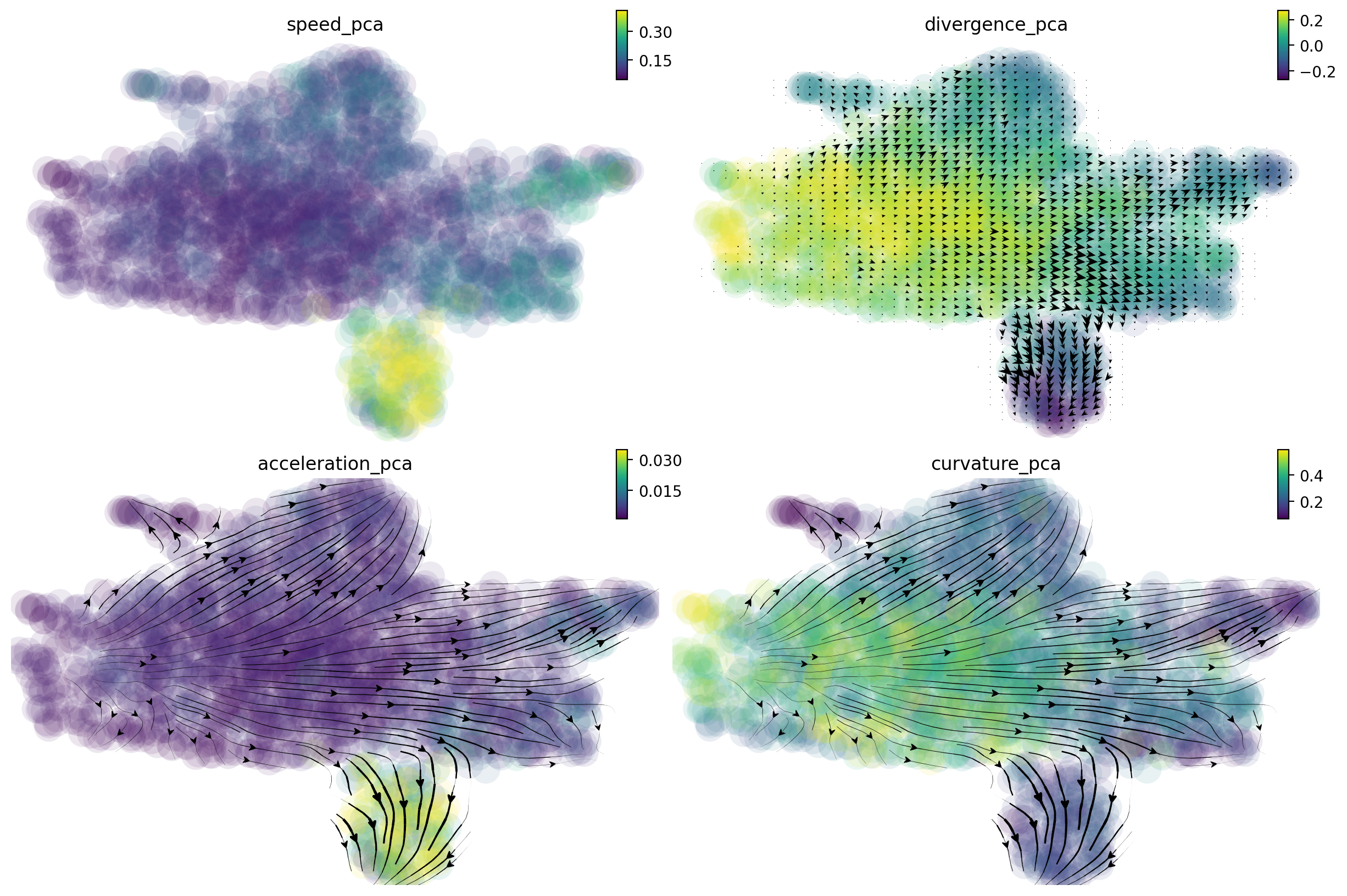
It is clear that the Meg lineage has the highest RNA speed, acceleration and curvature while the lowest divergence across all lineages. The curvature for the Meg lineage is also low.
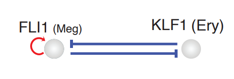
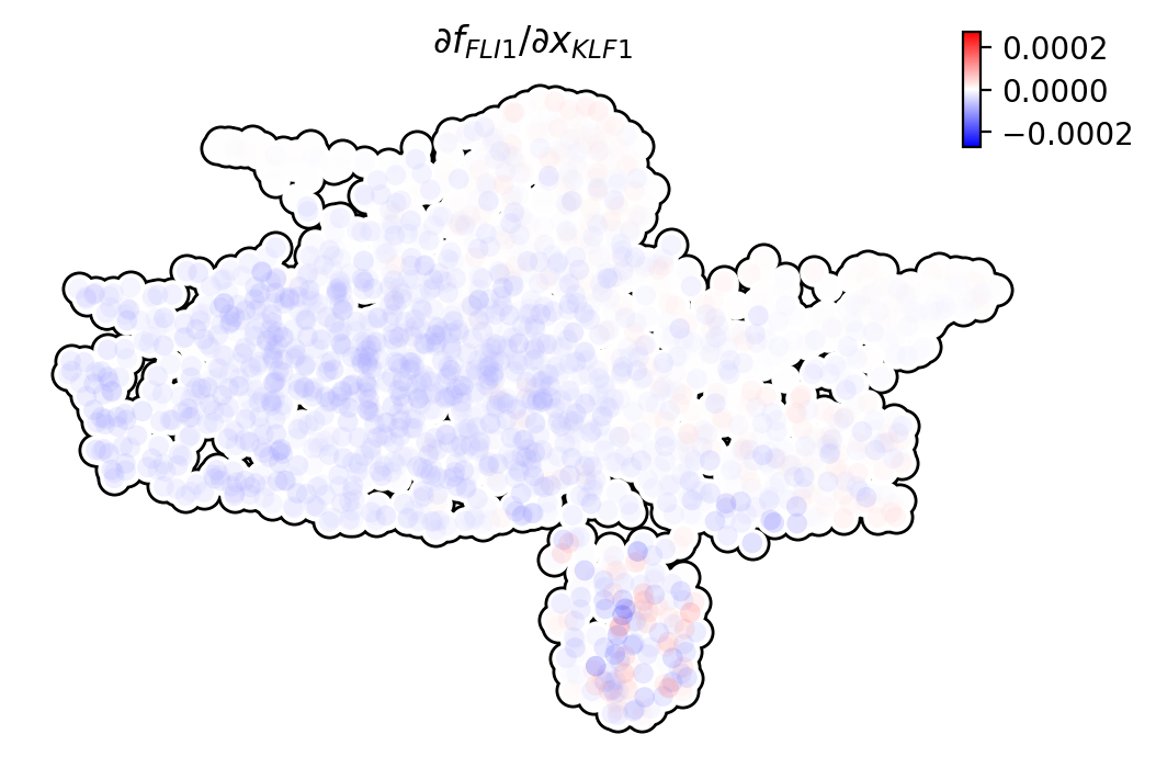
In order to reveal the underlying regulatory mechanism governing this early appearance, we perform RNA Jacobian analyses for these two master regulators. Our Jacobian analyses revealed mutual inhibition between FLI1 and KLF1 and self-activation of FLI1 (Truong and Ben-David, 2000). More details can be found in the following:
Compute RNA Jacobian between the two master regulators: FLI1 and KLF1.
Meg_genes = ["FLI1", "KLF1"]
dyn.vf.jacobian(adata_labeling, regulators=Meg_genes, effectors=Meg_genes);
Transforming subset Jacobian: 100%|██████████| 1947/1947 [00:00<00:00, 120423.96it/s]
Next we will visualize the RNA Jacobian between FLI1 and KLF1 across cells. From the figure shown below, it is clear that FLI1 represses KLF1 (the blue color indicates negative Jacobian) while there is a self-activation for FLI1 (the red color indicates positive Jacobian).
dyn.pl.jacobian(
    adata_labeling,
    regulators=Meg_genes,
    effectors=["FLI1"],
    basis="umap",
)
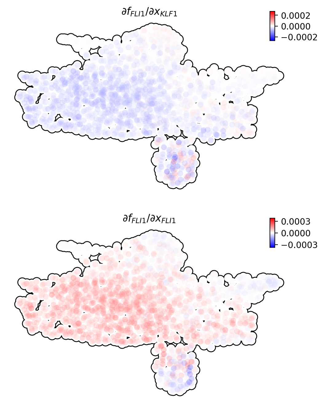
dyn.pl.jacobian(
    adata_labeling,
    regulators=["KLF1"],
    effectors=["FLI1"],
    basis="umap",
)
A schematic diagram summarizing the interactions involving FLI1 and KLF1
These analyses collectively suggest that self-activation of FLI1 maintains its higher expression in the HSPC state, which biases the HSPCs to first commit toward the Meg lineage with high speed and acceleration, while repressing the commitment into erythrocytes through inhibition of KLF1: